
GABBI SOONG

BUILDING A BRAND
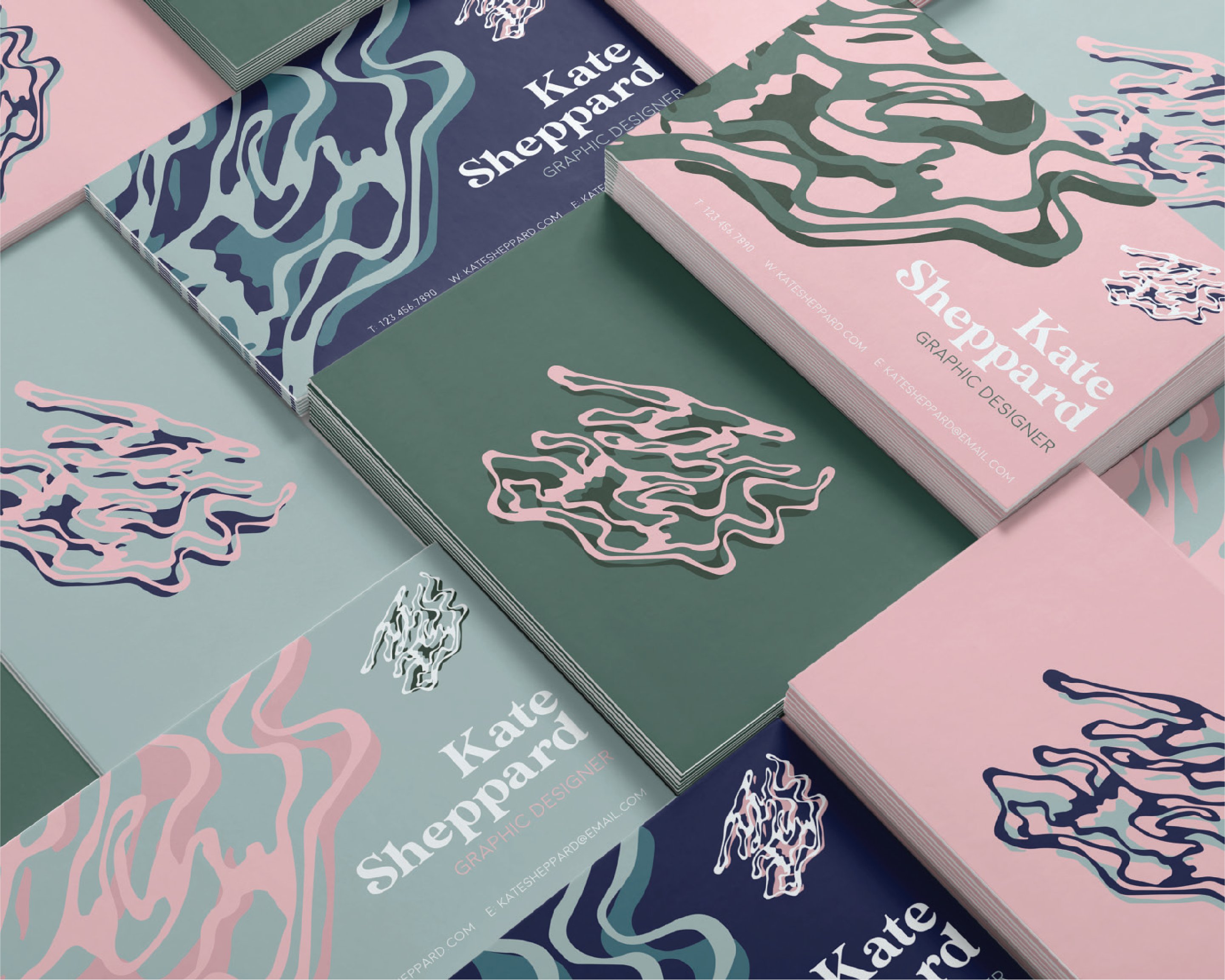
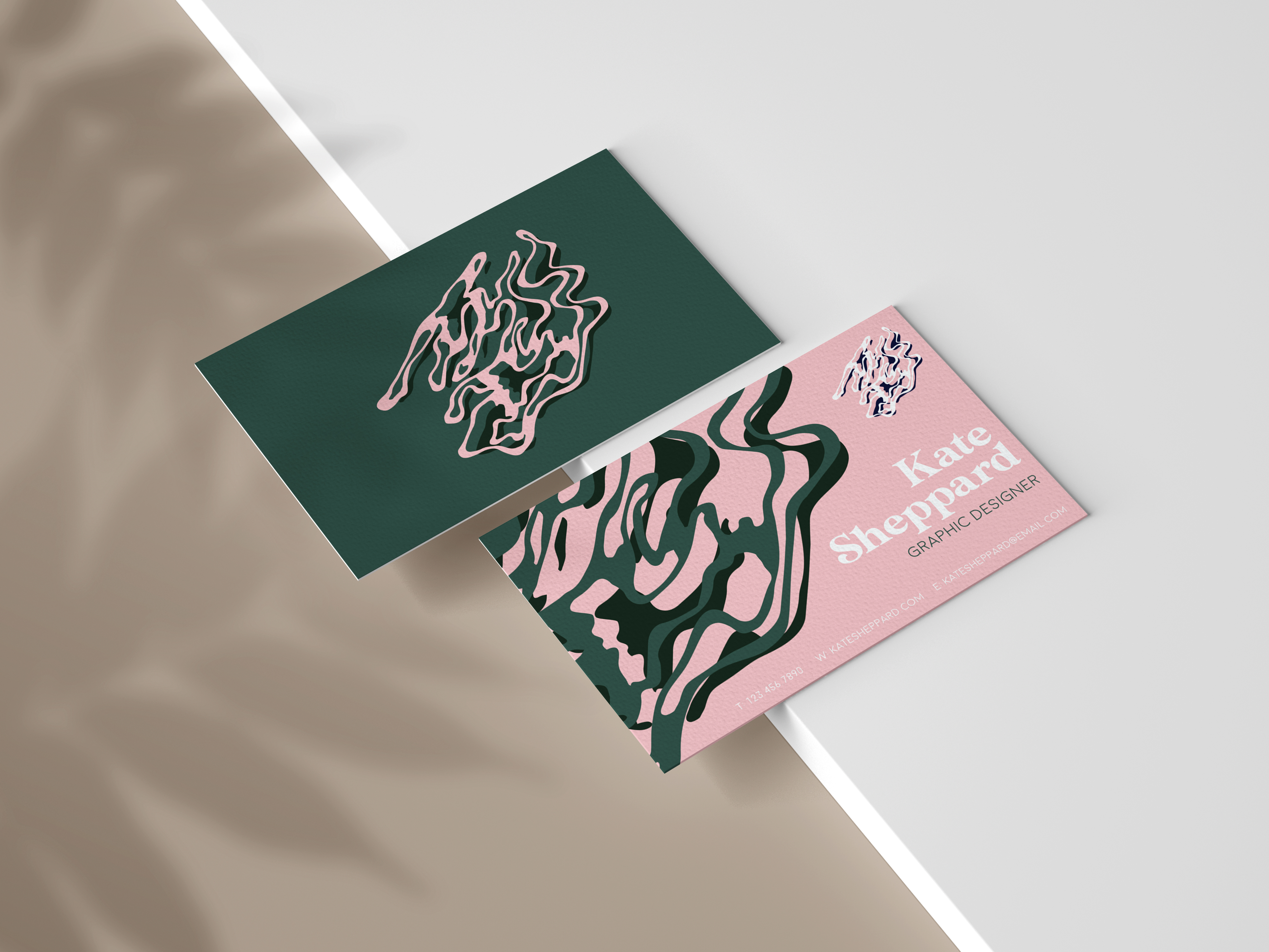
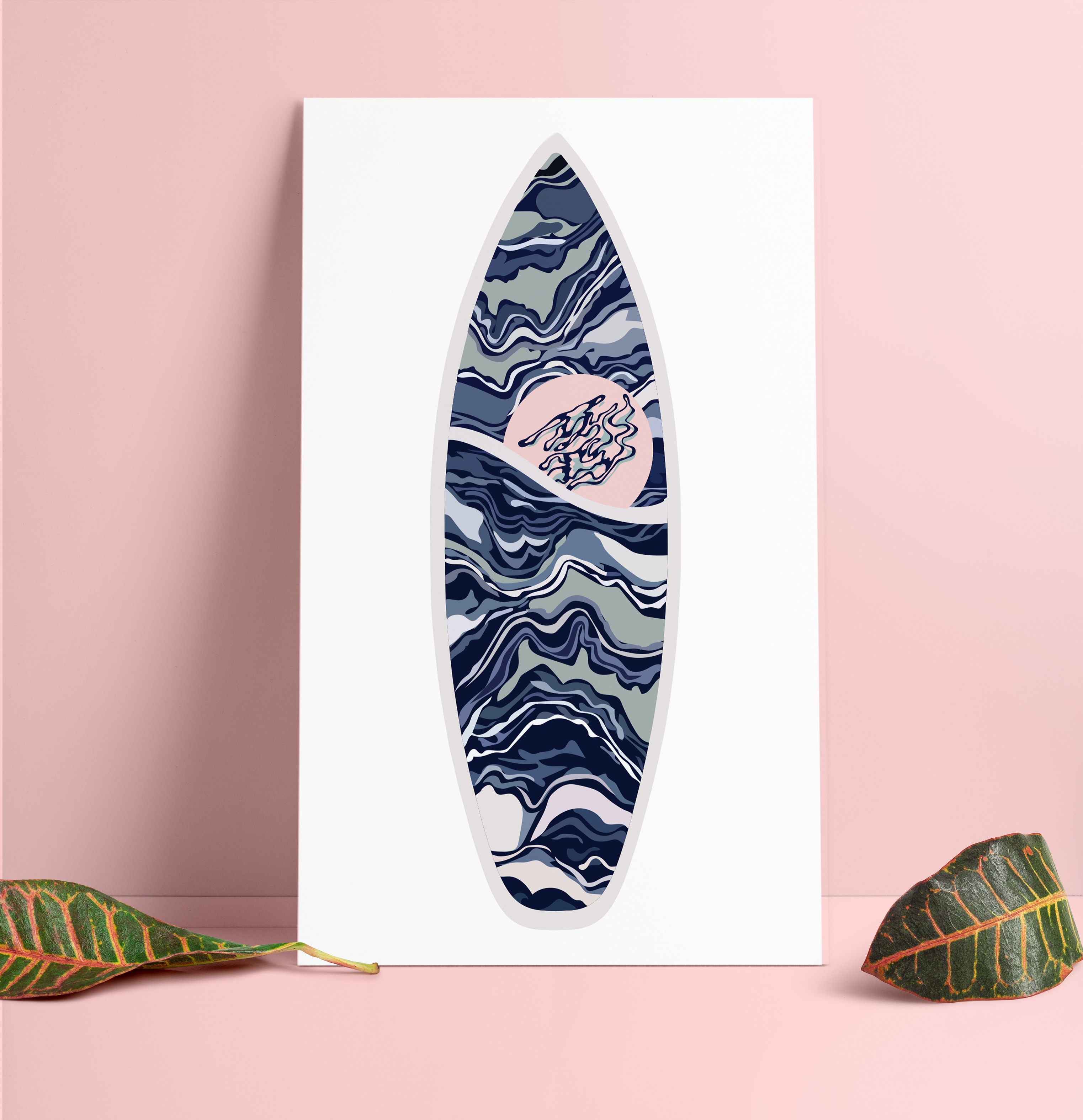
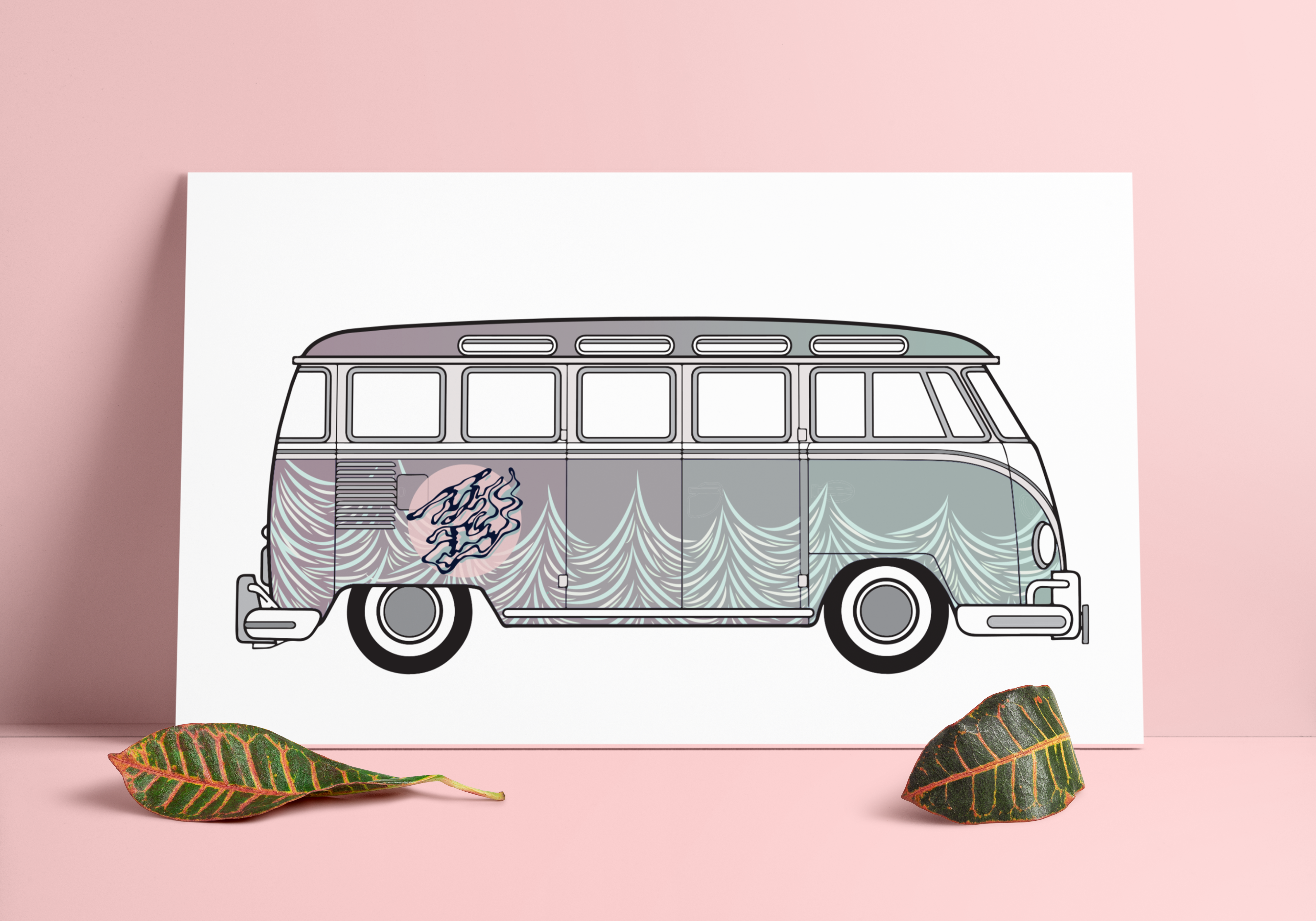
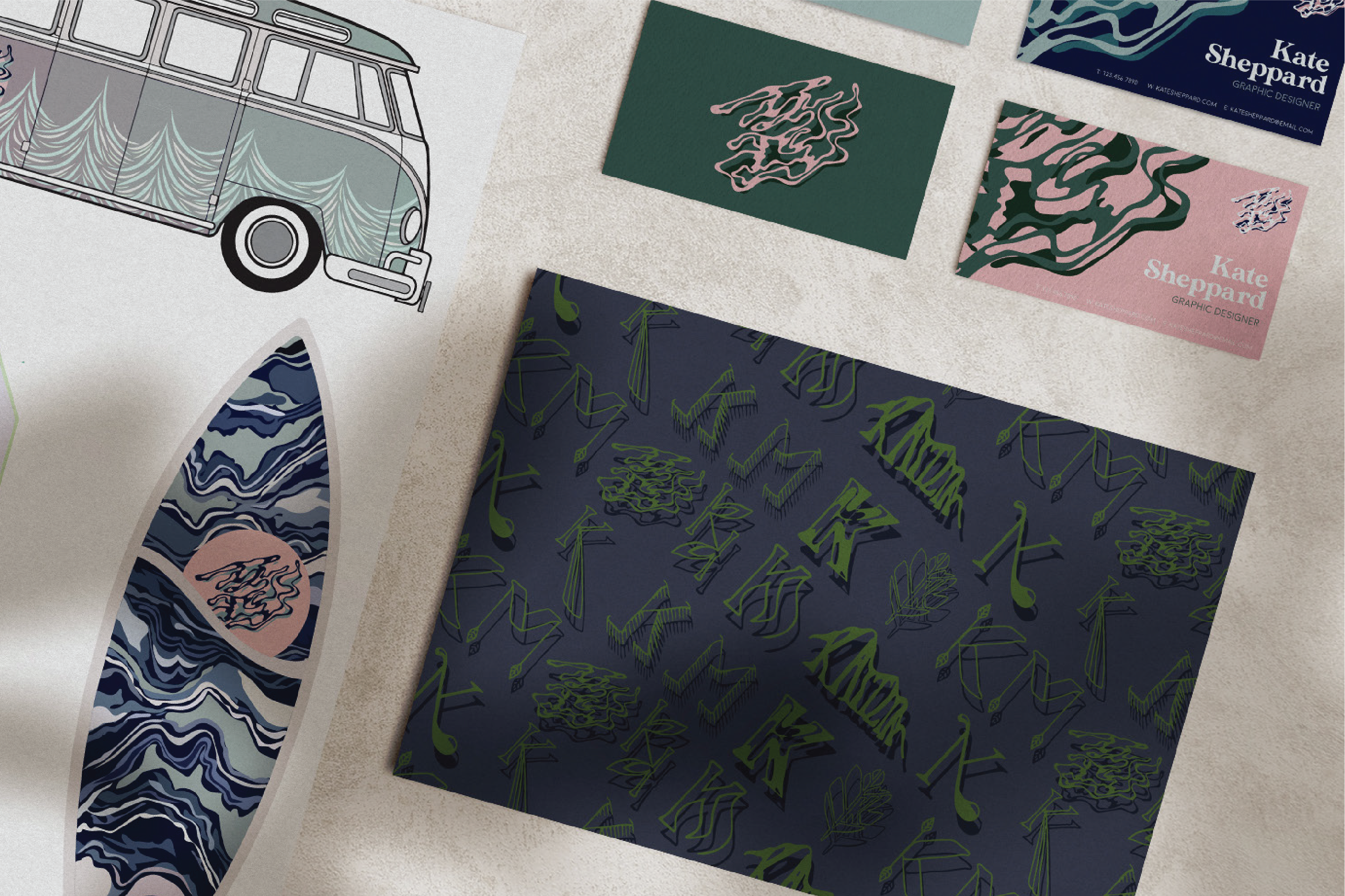
This is the branding I created for Kate, who owned a surfing company. I knew I had to design a logo that embodied Kate's depth of character and her immense fascination with nature. After almost a hundred drafts, we agreed to go with the logo that hid her initial “K” in the ripples of a puddle. For the rest of the branding, I wanted to continue to push this motif of Kate’s profound nature. I came up with a pattern for the VW bus that could appear as trees, waves or mountains, and I designed the surfboard to appear as an agate slice, waves, or the sky. Lastly, I took the honorable mentions of the logo drafts and recycled them into a pattern to use as stationary.